5 July 2019
Using colour in aviation interiors
Colour plays a big role in our lives and experiences. It may come as little surprise then to learn that aviation interior design is a concept with thorough strategy and thinking behind it. Designers of aviation interiors consider the comfort and feelings of passengers as their main priority when creating cabin interiors. Whether they’re flying short-haul for business or pleasure or in long haul luxury, there’s a colour and theme to suit.
Here, we consider why colour is so important in aviation interiors and explain all about the reasons why some hues are chosen over others.
Why use colour in aviation interior design?
Many people have their own opinions about flying. Mostly, it’s a method of travelling from A to B and the often-cramped leg room and restricted living space of economy class is simply a means to an end. That’s why so much money is spent on interior design of cabins – it’s the only real way to ensure as enjoyable and relaxing a journey as possible for passengers. And for the luxury interiors of first or business class and private jets, high-end design provides a real opportunity to create that home-from-home premium-feeling setting. Ultimately, the goal is to deliver as pleasant an in-flight experience as possible and much of that is said to come down to colour and the psychological benefits it brings.
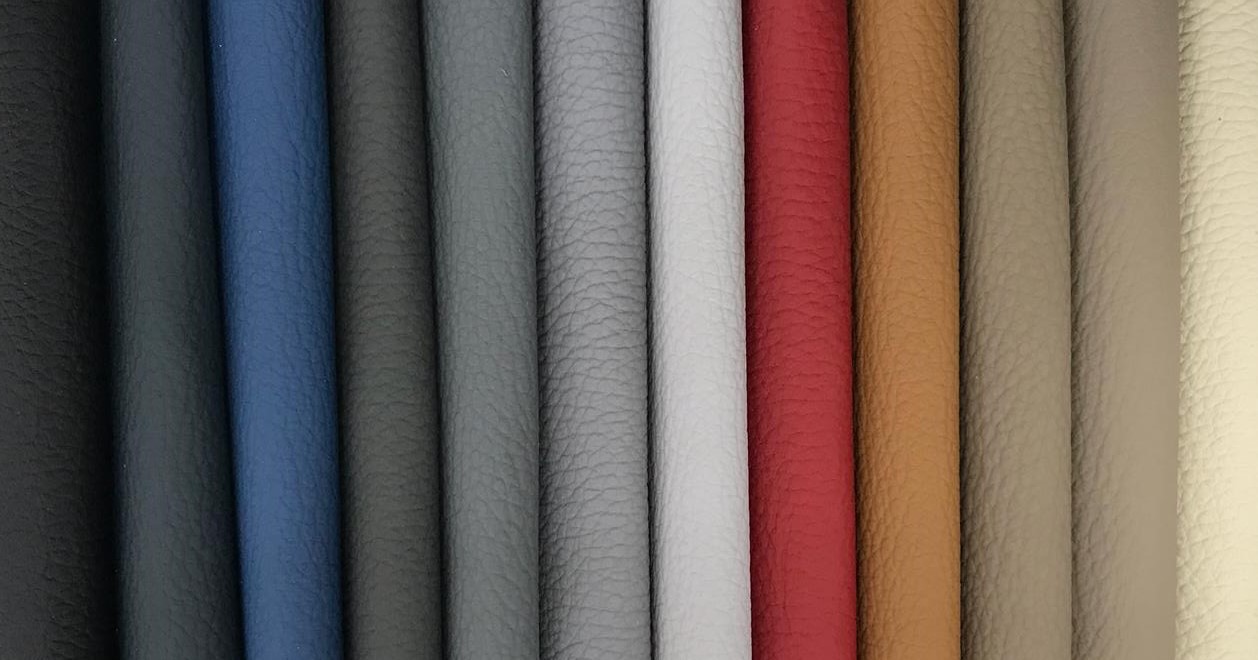
Neutral and lighter tones. Traditionally used in the more prestige spaces of first and business class and private jets, paler tones provide a homely feel and create the appearance of a larger, more open space. Neutral tones are easy on the eye and have a calming effect to help passengers on long-haul flights feel more comfortable and restful.
Darker tones. Blue is commonly found in aircraft interiors for a number of reasons. This calming and relaxing tone has connotations of trustworthiness, security and responsibility – all of which are extremely important in aviation so it’s the ideal colour for nervous flyers. Blue is the colour of choice for many airlines because it’s universally well-liked, conservative and inoffensive and is associated with feelings of coolness so it helps to avoid hot, stuffy flights. Darker tones also help to disguise stains frequently found in the material on flights – food, drink and ink stains, for example.
Brand identity and practicality
While psychology plays a big role in why a handful of colours are chosen for the in-flight experience, maintaining brand identity and perception is another key consideration. Airlines seek recognisable, stand-out seating that’s identifiable to their customers. Plus, using brand colours in this way helps break up seating spaces, creating division between classes as well as rows to produce ‘zones’.
At a time when catching a flight has become as simple and routine as hopping on a bus, intelligent use of cabin space is crucial. Using colour in design creates a relaxed, stress-free environment, a tried-and-tested technique that has a positive effect on the weary traveller’s overall in-flight experience.
At Yarwood, we produce aviation coverings to order, meaning designers can specify bespoke colours that we can produce in aviation leather, faux leather and fabrics. Want to find out more? Get in touch today for expert advice on aviation interiors.